Thursday 3 November 2011

3rd Year Work - Branded Content / RIZLA


Rizla

Brief

For our Branded content brief we were asked to use our conceptual and creative writing skills to feature a brand - such as BMW films. We had either the choice of creating a coffee table book or doing a short film, I chose the coffee table book option. For the book we were asked to create the softest sell ever free to use any South African language in a dynamic and interesting layout.

CREATIVE CONCEPT 

My concept for this book was mainly based around a student target market as I enjoy writing for a target market that I represent. I chose  to base my concept around student travel stories and experiences and after sifting through a couple of other student brands I finally decided on Rizla, the world’s most famous rolling paper - a necessity on any roadtrip, as the book illustrates. The coffee table book is actually more of a travel book as the book itself is functional and has perforations in the cover for smoking filters and perforate Rizla inside the book. I included both my personal stories as well as ones that I shared with others and even a friend’s story aswell as a section at the back for the reader to include their own stories

Rationale

The theme of the roadtrip is one that every student loves to talk about seeing as though it forms such an integral part of their student experience and is always the main topic of conversation when everyone gets back from holiday and is back at school reminiscing. I have chosen to do a booklet based on student roadtrip experiences as the brand I have chosen, being Rizla closely relates to the topic and plays a vital role in many good roadtrip stories we have from our student holidays.
The most integral part of the theme of the book is that all students have some story or other relating to their experiences when smoking it up or just general travel ‘rawcusness’, and more importantly often enough involving the endless missions in search of Rizla (roadtrip gold). The common thread in all the stories is that on these missions to find the Rizla we encounter people and places that essentially form unforgettable memories – the funniest part being that as unforgettable as they are, we always seem to forget them as a result of our recreational activities. This book is a celebration of those times and the stories we have to share. The book is functional as well in the sense that it becomes useable for the stoner who reads it as he can tear out the perforated filters and Rizla making up the book as he stones away whilst reading the stories told in the book. Furthermore, students can take the book with them on roadtrip and fill in their own stories as missions present themselves forming their own unforgettable stories, they just will never remember


Executions

The coffee table book in-situ


3rd Year Work - Brand Challenge


Brand Challenge

Brief

The well-known Brand Challenge at Vega Brand Communication School is an industry renown project where real-world brands present their real-world issues and/or branding needs to the second and third year teams at Vega creating a challenge where teams; comprising of visual artists, copywriters and strategists are put together and challenged to best meet the needs of the clients, often producing industry standard work giving students a chance to gain real-world client exeprience aswell as exposure.

The Brief my team were given was by the Henley Business School South Africa, whereby we were briefed by the head of the school on a locally relevant and globally resonant repositioning of the otherwise very colonial brand and were requested to reposition the brand both above the line and below the line with their branding and communication.

CREATIVE CONCEPT: THE CATALYST

Communication objective: Showing that success is always out there and Henley has always
been providing the path to sustainable success. All you need is Henley to catalyze a reaction.

Concept Rationale

You are the catalyst, Henley provides you with the right environment to set off a chain
reaction of sustainable success.

Success, just like Henley Business School, is ever-present. When the right environment
and the correct circumstances come together, all success is waiting for is a catalyst, and
that catalyst is the Henley student with their drive and ambition for success. With the
print executions we have shown how the right circumstances coupled with the right
environment and values in the catalyst, success is achieved. The difference with Henley
is that the success they unlock is sustainable and has far greater reaching effects then
merely bettering the student’s personal life.

Website Rationale

The website is the central focus of not only Henley’s message but the campaign itself. The elements designed in the website are in place to connect the current elements associated with the brand to new website as well as the global brand and website. Additionally we aim to have the website designed aesthetically different to the normative style of business school website design as we found them all to have the same look and feel. Bearing that in mind we still have included all the necessary elements that dictate Henley South Africa’s offering. There are elements that are concerned with engaging existing alumni and students with the Henley brand as well as to maintain involvement with Henley’s sustainable business efforts. Additionally a ‘South Africa’ button has been included for access to the Henley’s online publication and forums for debate. This is inline with the mobi media as well which is directed as smart phone apps that provide easy access to the online publication with current RSS feeds and forums for debate.

Contributing Members to Branc Challenge Team

Adrian Texiera   Visual Design
Ryno Viljoen     Web Design
Marcus Sapire   Strategy


Executions

Henley South Africa Website

Henley South Africa Print Campaign (Industry Magazines and Billboard)

Henley Executions
Please refer to Blog Disc (available on request) for external audio/visual executions


3rd Year Work - Online Launch Campaign / DIESEL


Diesel

Brief

Our third year Diesel brief required us to create an online campaign that would launch Diesel’s new fragrance “Only The Brave”, we were encouraged to make it a viral style campaign that would leave the target market wanting to share it and further the identity that is the Diesel brand. 

CREATIVE CONCEPT 

My concept for the Diesel brief as is visible through my process work was to maintain a viral feel around the campaign through the use of a character that would embody the fragrance and the brand itself, a character on a mission to find ‘The Brave’ around town mainly targeted at a student market as this was more the focus of the campaign; introducing Dangerous Dan

Rationale 

When asked to create an online campaign around Diesel’s fragrance “Only The Brave” my concept was to redefine bravery as confidence, and social confidence in specific. This is after all what we derive out of a fragrance as it gives us the confidence we need out there in the social savannah where only the bravest survive.

I chose to use viral media as my main form of communication as I feel it resonated with the tone of the campaign and of the Diesel brand in general. 
In order to best represent the concept of redefining bravery the social context would be the target and the everyday person would become the brave in a series of random acts of bravery. These random acts of brave and daring actions get instigated by a character exclusive to this brief – Dangerous Dan. An extrovert some what caught up between Ryan Seacrest and Wackhead Simpson, Dangerous Dan epitomises the Brave in his quest to find Only The Brave who are socially confident in doing his dares.

The Campaign rolls out in a viral sequence by the first of the themed webisodes “Campus Dares” gets uploaded via Youtube and is sponsored by Diesel ending with direct link to the Dangerous Dan microsite where fans can watch more of the weekly themed webisodes as well as interact with the campaign by rating them and ultimately joining Dangerous Dan in his challenge to find The Brave in the ordinary person. Joining the challenge entails rounding up a crew and filming their own definitions of the random acts of bravery consequently posting them on the microsite for others to view and rate and comment.
Additionally, as the weekly themes progress another form of online media will be used to entice people into engaging with the Dangerous Dan Diesel campaign as Web Banners will appear on theme relevant websites such as the banner in the video appearing on a dating site for the ‘girlfriends’ theme. 
And finally, the use of popular social networks in their general contexts where fans and followers can further interact with Dangerous Dan on a more intimate level through ‘friendship’ on Facebook and ‘tweeting’ on Twitter. Lastly, Foursquare mobile will be used to record Dangerous Dan’s movements through town highlighting the hotspots in his search for Only The Brave.


Executions


Dangerous Dan Viral Video

The Dangerous Dan video is a viral short film about the character’s escapades in his first episode which takes place on campus. The video begins with a few clips of Dangerous Dan showing the viewers ‘how its done’ with his random acts of bravery around campus for example talking on his cell by the ‘No Cellphones’ sign, or riding the delivery bike by the ‘No Bikes’ sign. The video then shows his search for ‘The Brave’ on campus going up to random groups of friends and coaxing them into committing the ultimate random acts of bravery like getting a kiss from the random promo girl, or slapping the MC’s ass as he runs by the crowd. The video also includes how viewers can stay in touch with Dangerous Dan and follow his whereabouts on his search for ‘The Brave’ ultimately encouraging them to join in the fun, grab a video camera and go on a search of their own.

Dangerous Dan Microsite

Dangerous Dan Social Media - Twitter

Dangerous Dan Social Media - Facebook


Please refer to Blog Disc (available on request) for external audio/visual executions
3rd Year Work - D&AD Brief / OXFAM


OXFAM

Brief

The D&AD brief was the first of our third year and it was the first of our integrated campaign briefs. We were asked to present an idea that engages support for OXFAM by triggering shared values and concerns in a wide range of people, aligning supporters with OXFAM’s pledge to overcome poverty and suffering and through this engagement and empathy, inspiring them to action provoking a long term interaction with the brand and he beginning of a life-long loyalty to a cause with which you share common values

CONCEPT & RATIONALE

As humans we all innately feel the need to be a part of something bigger than ourselves, whether it’s in the way we dress or the way we pray, we align ourselves with the people who believe in certain things as strongly as we do. The power behind a group of people with a cause is a strong one and by providing a network where they can connect and put their skills to use, we can create engagement with the OXFAM causes and additionally create a long lasting relationship with the organisation. The final aim of this campaign is to not only build an awareness about the things which OXFAM do, but to create the platform for people to
begin taking on poverty and injustices in their own backyards

Campaign Rollout

The Campaign is essentially aimed at getting those who share common values and concerns with OXFAM, who are seeking the platform to express these values, to engage with the Network For Change and help to realise its potential in changing the world. The aim of the tube takeover will be to direct those who are ripe for engag ement to the Network For Change, whilst exposing others to the campaign and in turn, l awareness about it.

Tube Takeover

Imagine if for just one day the millions of commuters that make use of London’s underground transport system were exposed to the power of working together as a network of people who want change? for just one day, the Tube will become the Network For Change, a campaign in which all lines will be renamed after the many causes OXFAM fight for, furthermore, all commuting profits that day will be put toward the causes on the tube, and in doing so, unwittingly engaging those with no interest and proactively involving those who do
Verbal flash mobs will be on the carriage comprising of about 10 or so OXFAM volunteers who will occupy each carriage and conspicuously begin conversations about the given topics on that line.

Executions

Online Executions

Online Executions

Tube Takeover - In Situ

Tube Takeover - In Situ

Print Executions - Tube

Print Executions - Tube

Print Executions - Tube

3rd Year Work - Pull-In Underwear


Pull-In Underwear

Brief

The Pull-In Underwear brief was given to us by the brand owners themselves where we were introduced to this international brand that was just hitting South African shores at the time, with stock availability only online or at Mooks store in Rosebank as far as Johannesburg was concerned. In the briefing we were given an introduction into the international brand’s identity and asked to create a launch campaign where the brand would be launched to their identified target audiences in South Africa with the goal obviously being to create a cult like following behind this ideological brand.

CREATIVE CONCEPT

My concept for the Pull-In Underwear brief was based on a psychographic focus of the target market which I had defined as working class because of the exorbitant prices of the underwear. My concept had focused on the fact that when it comes to original underwear it provides the wearer with a mischievous sense of identity as they are the only ones who know what they are wearing, very similar to instances where women wear black lingerie under their work clothes as it makes them feel sexy and gives them an edge. The concept for my Pull-In campaign targeted exactly that aspect of the underwear and those who would be buying it, showing instances where Pull-In underwear give them the license to De-Adult themselves.

Rationale

From my research it was evident that people (and specifically those in the working class) enjoy wearing daring underwear as it allows them a feeling of mischievousness in their everyday mundane life, for example having a pair of sexy lingerie undies in the boardroom often gives women a sense of mischievousness as only they know the sexy underwear they have on whilst the workplace remains oblivious. It is this mindset that I aimed to target in my executions and concept.
My concept of “De-Adult Yourself” is directed at the slightly older target market who are generally involved in office spaces and have an income that can afford them a selection of Pull-in underwear so that the collection is not as important as what the brand stands for in their minds. The mischievous nature and expression that follows the Pull-In brand is the underpinning concept behind “De-Adult Yourself”.

My executions are all based upon situations where the target market are familiar with and are well aware of the norm with regards to the ‘straight’ nature of these environments. My campaign appeals to their “inner child” and encourages them to ‘de-adult’ themselves in such serious environments such as the secretary blowing ‘chappies’ bubbles at her desk, or the business man blowing bubbles into his merlot. The Radio ads are a direct translation of the print; whereas the internet banner ads follow a more childlike approach where banner ads on ‘business sites’ are hijacked in a humorous way and the subsequently tagged by Pull-In with the tagline “De-Adult Yourself”. The concept is – Rules Shmules. Leave it to the grown ups.

Executions

Print Executions - Men's Magazine

Print Executions - Women's Magazine


Radio Advert – Slurping

Client: PULL-IN Underwear South Africa
Copywriter: Daniel Portal
Duration: 18’

SFX: Typical restaurant ambience, posh and elegant with classic    
         jazz style playing in the background

SFX: Ambience is broken with the sound of someone slurping out
        their glass

MV01: The french waiter clears his throat gently and asks the
            slurping patron “would ze monsier like anozer glaz of
            chardonnay?”

SFX: All ambience fades out

Ann: Pull-In Underwear. De-Adult yourself. Available at Mooks in
         Rosebank


Please refer to Blog Disc (available on request) for external audio/visual executions


2nd Year Work  - Online Blog "The Shit Awards"


The Shit Blog

Brief


In our second year we were given an assignment where we were asked to create an online blog that specialised in critiquing bad adverts in circulation. This was to be completed in all the media genres namely; Print, Outdoor, Digital, Alternative and Online.

Concept


The concept we had gone with on our project was a satirical blog based on an award style critique given by three fictional judges that we had created for the blog. We affectionately named the blog “The Shit” after the slang term that young people use when referring to anything awesome. However our approach was more a play on words as these adverts really are ‘The Shit’ and not in the good way, the winner obviously being the worst one.

Rationale

This rationale is based upon the winner of The Shit awards and why we had chosen that particular advert
The advert we have chosen to re-execute is in the digital media category.

The viral screensaver used by the University of the Witwaterstrand in their marketing campaign to get more students out of high school to apply and study at tertiary level as opposed to not taking up the opportunity resulting from being unable to chose a career path or a lack of ambition with regards to studying further at tertiary level.

The strategy behind the current advert is to market the detriment of life without a degree to these students by showing life from the perspective of people who have to live life without a degree such as construction workers and rent-a-cops.

The problems we are addressing with the re-execution of this advert is the strategy behind the visual communication as well as the copywriting and how these two elements are lacking in resolve and synergy with the brand message communication objective. With regards to the visual representation of the ad’s message, the aesthetic is translated in a substandard ‘home video’ visual. Additionally the copywriting is of an elementary tone and register which does not sustain the message that the institution will provide students with the ability to further their education and in turn their life.

We have changed the visual of the ad to be based around the concept of a tongue-in-cheek joke about those who do not obtain degrees. By using the detriment of life without a degree in a humorous way, students can relate to the idea of the benefit of obtaining a degree. In addition to that, the copy in the advert stands as a call to action for the intended target audience to take a proactive step in applying for a wits degree and in doing so are able to empower their future which ‘starts now’.

The form of this digital media will be given as a set of screen savers with different jokes that have the same idea and the same copywriting call to action. An example of another advert will be a picture of a pizza box and the copy: “what is the difference between a pizza and person with no degree?... One can support a family”.

Contributing Team Members

Ross Cohen Visual/Web Design
Mikhael Cohen Visual/Web Design

Executions


Website Copy 


About Us

The Shit is an advertising awards blog, showcasing the best of the worst in substandard advertising. Eight carefully selected adverts are exhibited and critiqued by our panel of judges. The panel of three revered and renowned judges consists of Jubel Von Bronckhorst, John Katzini and Meryl May. Each judge, well respected in their own right will deliver critique in their expertise and ultimately the winner will prevail as The Shit. Finally one of the eight adverts will be chosen for re-execution by the panel themselves, this being the ultimate praise.

Introductory Copy

In accordance with Rebrand 100, The Shit awards are proudly bought to you in our interactive critique blog. Along with the esteemed panel of judges the public are invited to engage in showcasing The Shit.

Plax

JvB: Plax, one of South Africa’s leading mouthwash brands have teamed up with the third Reich marketing strategists to formulate this surefire display of mouth germs’ demise. Plax’s strategy is marketed at health conscious adults. There is not much in this print campaign that depicts either health, or a healthy consciences lifestyle. I suppose the firing squad coupled with an outrageously gloomy setting might just scare you into buying the product

JK:  a firing squad entirely prepared for death by the bullet and one man’s germs being spared the grief. The image of the gloomy setting communicated an idea of death by germs, in no way is the visual aesthetic communicating fresh breath or healthy gums

MM: “kills the germs that cause bad breath” – the brand message is communicating the product’s benefits of a germ-free fresh smelling mouth, the visuals however do not resonate with the brand as the extreme measure of a firing squad implicated negative associations and will trigger adverse connotations in the consumer’s mind.

Lunch Bar

JvB: marketing an appetite quenching chocolate bar requires pin point communication s the product occupies a specific place in the mind of the consumer. Mixing connotations of a shark attack, however shocking will detract from your original communication objective as an appetizing “man size” treat.

JK: representing the new ‘man size’ lunch bar in peril of shark attack to demonstrate the chocolate bar’s size is an honest cause for concern. Aside from the natural emotion of primal fear evoked from such an image, showing a chocolate bar at sea is almost bad as a mixed metaphor.

MM: well, from a copywriting perspective an advert without any from of reference is just an image. Although this technique can be strongly implemented, the ambiguity of the image leaves the advertisement with no direction other than communicating a new chocolate bar that has undergone somewhat grossly exaggerated size change.

Teasers

JvB: The Johannesburg strip clubs have adopted a rather unique strategy behind their marketing. With a tongue-in-cheek humor, exploitation of “sex sells” is at a near cliché level. Typically the strategy behind the marketing on these billboards is to place them in high traffic areas attracting attention and those with enough money to ‘come and indulge’. No pun intended. Essentially, this outdoor example is of no difference excepting that the usual ‘come and indulge’ has been turned into a ‘come and inspect’. I am fairly sure that the last thing on a heterosexual man’s mind in a strip club is the chance of his blonde showpiece having a showpiece of her own.

JK: if sex sells than Calvin Klein has got nothing on this billboard. Furthermore, a brand such as this could have nothing more than the subject matter and a logo and that would suffice. The arrangement however is strange and seemingly cluttered. It is almost as though all of the information on the billboard is disturbing ‘the view’ which portrays more of a fetish type effort than a strip club.

MM: As Jubel mentioned above, the last thing on a man’s mind in a strip club is a hermaphrodite, more so, an Olympic one on trial. Aside from the tastelessness of exploiting a rather touchy subject at best (pun intended), downplaying a national hero seems like a “sleazy” strategy to me.

Renault

JvB: The strategy is to claim that the Renault Megane sport is superior in its segment by marketing its power. Through the use of South Africa’s power crisis, Renault communicate the car as an extremely powerful car with no “power shortage”. The intended audience for a car such as this may well be the same intended audience of a power out, a time at which they might regret having bought the car and not the generator. The message is ambiguous, and because the ad is extremely copy driven, one might be left thinking Eskom are making a joke of the unfortunate circumstance – good thing they reaffirm the message with “Renault Megane sport – 169kw” obviously the leader in its class no?

JK: A decal on a billboard that traps enough sunlight to glow at night is a fantastic concept. It’s such a pity this genius was left with the team behind this ad. Clearly the lack of imagery enforces the copy – a front on which the ad is definitely lacking. Perhaps the most unfortunate part of this entire billboard is the choice of font, resembling a half-mast attempt at a bubble font for a sports car, apparently the best in its segment

MM: The woes of miscommunication. The saddest part of miscommunication is the lost look on your target market’s faces as they ‘whizz’ past your billboard contemplating the ambiguous content they are attempting to decipher. Using only copy to demonstrate a ‘power crisis relevant’ concept should display courage and tenacity as opposed to a guessing game lasting the same time it took to drive past the billboard.

Energizer

JvB: The digital media market is fast becoming the quickest and most accessible forms of innovative brand communication. This energizer ad aimed at communicating the power behind the batteries makes use of this interactive platform, perhaps too interactive though. This increasingly popular platform has been maximized to its potential forgetting that user ability is key in this exercise leaving room for error when involving the external ‘sleep’ control the batteries have over the computer. Hopefully, no one is working on a massive project when suddenly the ejection of a random pair of batteries leaves the user staring at their reflection in the black of their powerless machine.

JK: Visually, making use of batteries and computer power comes across as a natural association. Moreover when lithium batteries are concerned, yet the specific arrangement of having a randomly placed battery compartment come across as an unresolved aesthetic. The compartment and batteries are disproportionate to the rest of the items on the desktop leading the eye to an uncomfortable position when looking at it. Furthermore, the composition of the compartment in relation to the computer’s battery life information display increases the gap in the communication objective by leaving the consumer in limbo before making the given association.

MM: perhaps a strong copy line to back up the ‘widget’ might increase the purposefulness behind the brand message, but the sheer lack of any sort of reference to the brand, other than the label on the battery displays the confusion one might encounter upon receiving this digital media ad. Not to mention what happens when the computer suddenly turns off.

Wits

JvB: I became rather disappointed to in the knowledge that a major advertising agency was behind this media. In their research they found that students out of high school do not further their education as a result of either confusion or plain laziness. Using the daunting prospect of life without a degree they aim to inspire students to study, at WITS. The foremost issue with this strategy is that marketing behind a computer screen is hardly ably to address an issue like a lacking ambition. Secondly, through communicating a mundane job of an uneducated construction worker lacks in the impact required to deliver the tertiary institutions message.

JK: The platform of digital media is one that requires intelligent composition and use of subject matter in order to achieve the desired effect. This advert is in the form of a screen saver. The image is lacking in any sort of visual resolve and composition that the student might in fact get bored at the prospect of watching the screen saver no less applying at the intended university. Aesthetically, the ‘home video’ look and feel detract from the message as it communicates the circumstance as opposed to the associations made with the product, being a degree obtained from WITS.

MM: The copy in this ad adopts a rather elementary tone and register. This contradicts the entire message of achieving an esteemed education as the copy does not create that immediate association. The use of grammar is first level and fails to communicate that without a WITS degree; the student will not excel and reach his/her true potential.

Feed SA

JvB: Many NGOs must adopt a marketing strategy that will shock the viewer into being compelled through agency or guilt to help the helpless and get involved. Although the frequency of this campaign reached its full potential, its message does not follow suit as certain elements of this campaign were not completely resolved in strategy. The communication objective is to show ‘affluent’ shoppers how easy it is to feed the hungry. Yet, what happens when the monthly shopping covers up the beckoning guilt stuck to the bottom of the trolley? Then the same issue that the very ad is designed to address being “don’t walk away” is repeated in exact fashion; the shopper shoes to ignore and swiftly moves along with daily life – in this case grocery shopping to feed their privileged and more fortunate family.

JK: This advert is the guilt factor 101. Much like Kevin Carter’s photograph of the Sudanese baby and the vulture, the shocking imagery is aimed at coercing the wealthy into taking a stand against impoverished hunger. Indeed this is the best and only way to achieve such impact. Visually, the pure shock of a homeless child in your trolley might be enough to keep you from shopping at all; however, the exaggerated use of stereotype weakens the impact of the message.

MM: “see how easy feeding the hungry can be?” … “and see how easy covering them up can be too? An NGO ad should use the guilt angle as much as possible, but when your message lasts the length of the walk from isle nine to eleven, how effective using such an image to show the plight of the hungry?

Clorets

JvB: The shopping mall arena has become a saturated collage of brand clutter. Food retail outlets are no different excepting that the clutter is edible. By direct process of elimination, if your ad is not visible, and even less decipherable, the clutter will make mince meat of that brand. Strategically aimed at communicating the benefit of Clorets as the breath freshener that targets even the toughest of adverts, this alternative campaign lacks in the synergy required to power the brand’s message directly to its relevant audience as a result of poor visual communication and a lack of copywriting to orientate the consumer with the brand.

JK: The campaigns message is that Clorets targets bad breath, typically caused by these infamous symbols of bad breath – and yes, it seems as though coffee is one of them – along with garlic and of course cigarettes. The visual communication in this ad lacks in intent and in fact creates more confusion than anything else. Vectorised images of stereotypical “bad breath” symbols are placed directly in line with the viewer’s line of sight causing ambiguity as to what exactly the images might be, such as the cigarette in the ashtray which resembles more of a bio-hazard warning then a target for Clorets Eliminator.

MM: placing what vaguely resembles a cross section of an onion in the crisps isle s questionable in terms of context, but highly questionable in terms of effectiveness as the image is uncertain and the copy so small I struggled just to see it, let alone critique it


Intro paragraph

Welcome to the Shit awards website, here you will find showcased the best of the worst in substandard advertising in four specific media platforms. An esteemed panel of expert judges will provide professional critique on the adverts eventually nominating the Exemplar of The Shit.

Judging Criteria

These are The Shit awards judging criterion and guidelines:

The strategy outcomes are:

Brand message is well linked to other elements of the advert such as the visual design as well as the copywriting and overall outcome of what is conveyed.

The strategy carried out in the advert is closely linked to the marketing strategy of the brand creating synergy between strategy and creativity, ensuring the advert and its core communication objective reach the intended audience.

The visual outcomes:

The visual outcomes will judge how the advert makes use of the medium as well as how the specific visual elements of advertising are resolved through their use or lack thereof.

These visual elements will be judged on how they are resolute within the adverts. These elements include: properties of subject matter, special and temporal layout and the relationship of objects to each other

The Copywriting outcomes:

How the advert is played by copy and how it contributes to overall message of the advert in relationship to the other elements visible.

How the copywriting resonates with the strategic intent of the marketing strategy as well as the visual communication objectives defined in the strategy.

Gold and Silver Ribbons

These ribbons have been allocated as the signifiers of standard in the overall positioning in each category:

Gold ribbon: the advert in the specific category that is least able to resolve the elements used for judging them

Silver ribbon: the advert that manages to better resolve synergy between the visual and copywriting elements as well as the strategic outcomes and communication objectives intended in the advert.


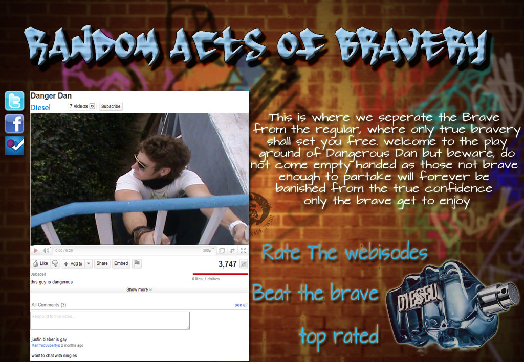
2nd Year Work - Jozi'Khaya


Jozi’khaya

Brief

Johannesburg, the calabash of culture, the melting pot of dreams, hopes, and aspirations. The city of gold is alive with every heart-beat of its inhabitants, but what makes Joburg a unique city amongst others around the globe lies in the details. The intricacy of the lingo, the various forms of communication in which the city’s dwellers commute, inform and deceive. The 12th unofficial language that binds the variety of cultures in this bustling urban jungle; the language of signs.

The taxi taal, used by every Jozi commuter; an original form of communicating a destination between driver and passenger without the need for a sign-post or spoken word. Significant hand gestures displaying one’s desired location, “The Gun”, “The one-two”, and the ”sho’t left”. These minute aspects of life in Johannesburg are the essence of its unique culture.
The vendor taal, the unique system of coded words and warnings used by the city’s many illegal vendors of pirated and stolen goods. A name, a number or a hand signal employed by the underground community of illegal hawkers to warn each other of police presence and ambush.

Additionally, there is the tsotsi taal; the signs and symbols that form the devious communication between thieves used to relay techniques of trespassing to each other. Different coloured objects and symbols are being used by house thieves and gangsters to determine the levels of resistance they will encounter during a break-in.

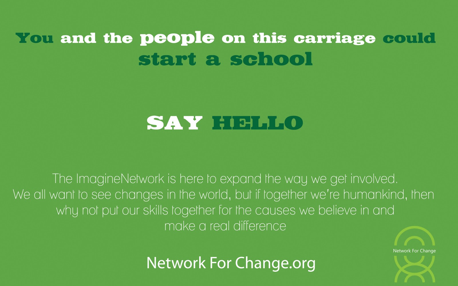
Jozi’Khaya is the voice of the underground. The voice box to the heart beat
That breaths life into Jozi’s every day. The first of three projects to be launched is called “Victims of Colour”, and deals specifically with aiming to inform the public about the colour scheme being used by house thieves and gangsters. What Jozi’Khaya seeks is the definitive platforms to launch this original and unique project. Jozi’Khaya would like you to create a media campaign across the various media and multimedia platforms to create awareness about this project.


THE BIG IDEA – CONCEPT AND CREATIVE RATIONALE

Johannesburg is many things; a home, a hub, a capital. When we reflect on the essence of this city of gold we look back on history filled with turmoil and anguish. Yet as we move forward into a bright future the citizens of Johannesburg can look at one another and know that this progress has not been an individual task. We have worked as a team, as a nation to eradicate all that is holding us back. The journey has only begun.

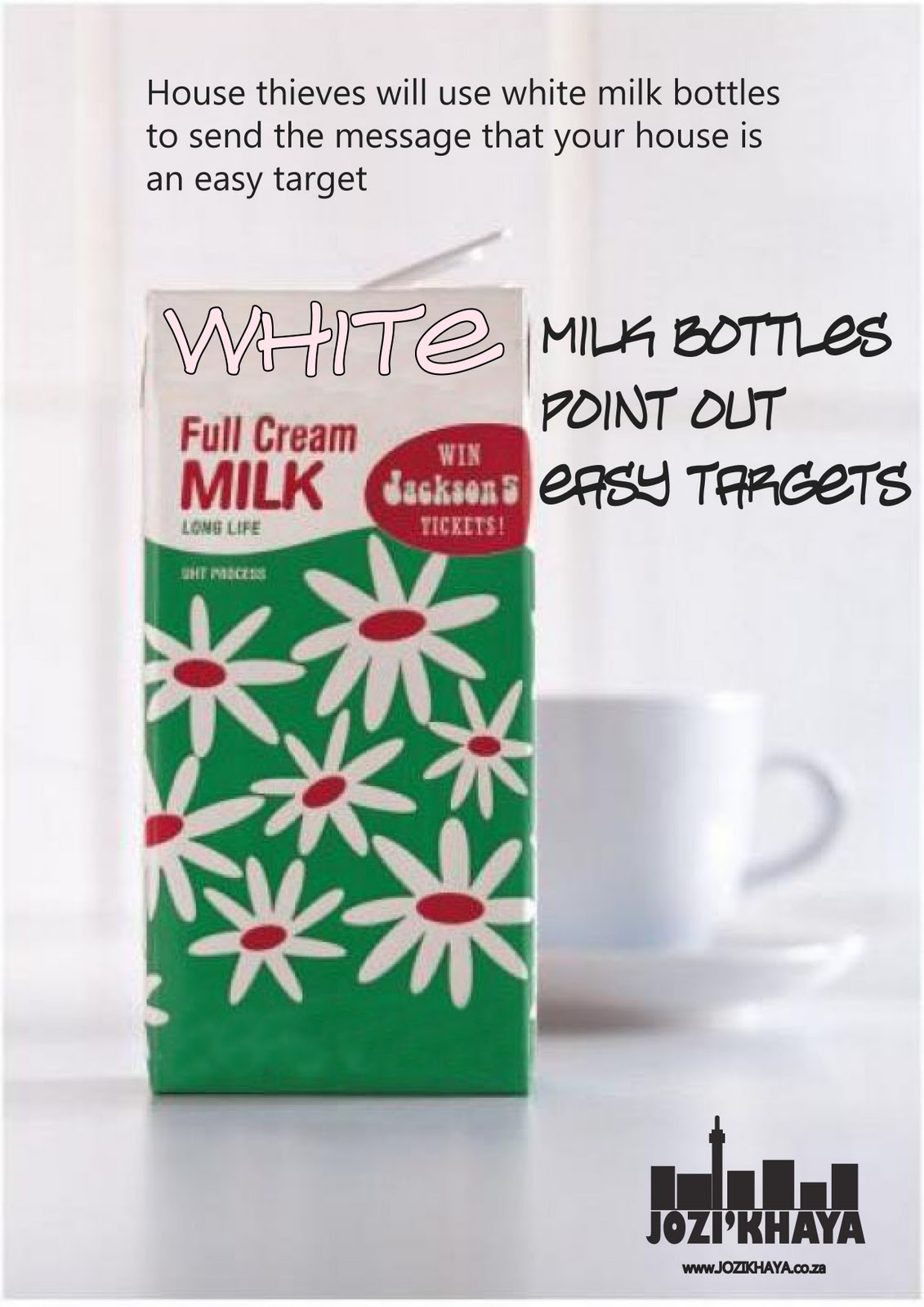
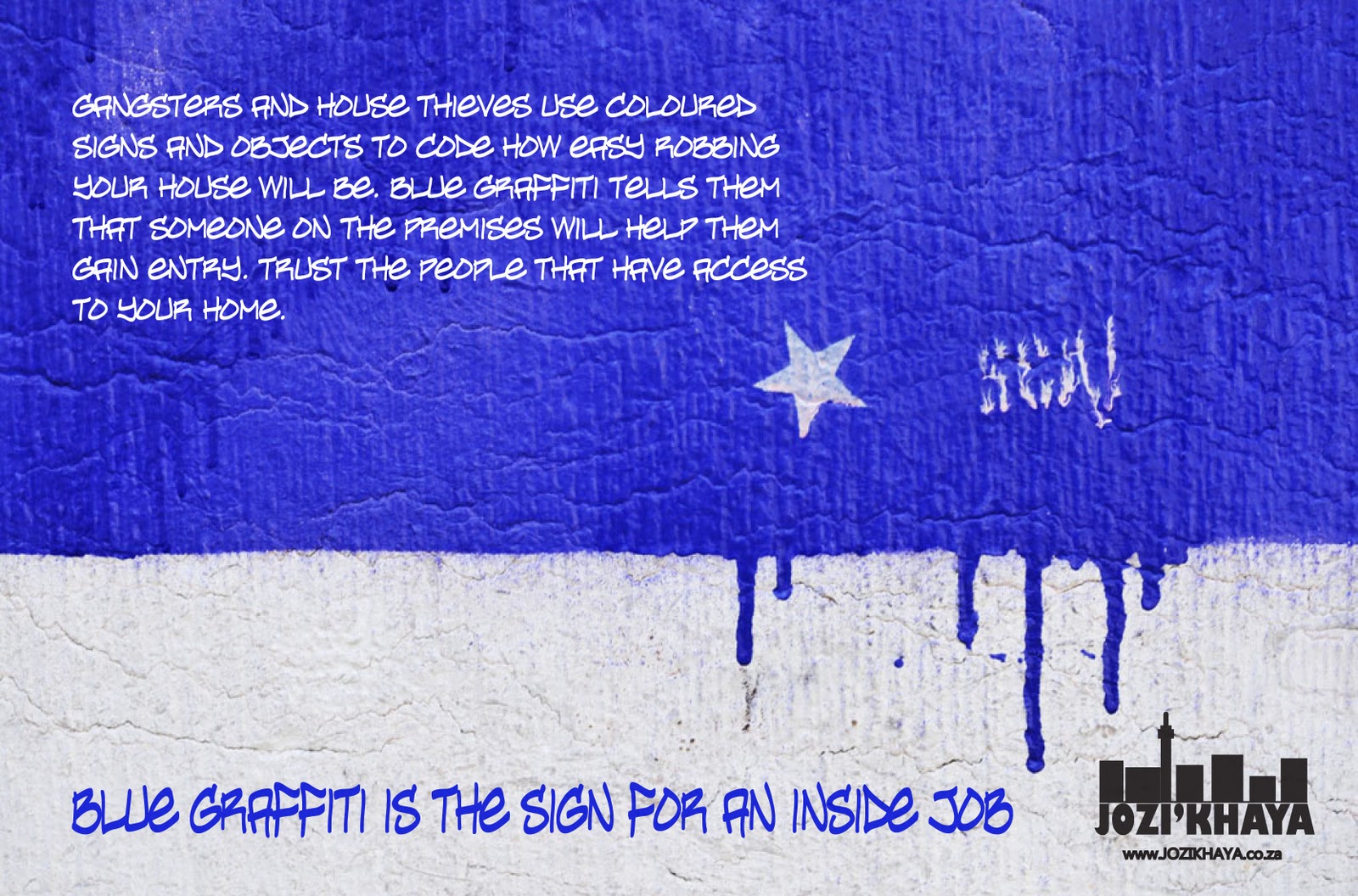
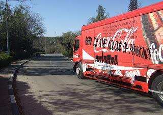
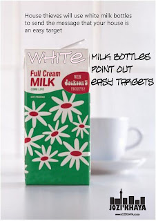
The Jozi’khaya brief required a multi-platform campaign with which to launch a community based awareness project aimed at informing the public of the devious tactics and strategies being employed by criminals in burglaries. Gangsters and house thieves are making use of a subtle system of coloured objects and signs to relay information to one another about a specific property. These various colours signify the diverse levels of resistance burglars can expect to receive upon breaking and entering. Although many objects are used for colour, certain items are used for their recognisability. These items are red coke cans, green crème soda cans, white milk bottles and blue graffiti tags.

Perhaps the best way to inform the public of these symbols was to make use of the already recognizable objects in their marketing environment. In other words, why make your own red billboard about coke cans, when you can use existing coke billboards, or trucks in this case (trucks mobility is more useful). And so the media campaign formed upon that platform using the coke trucks and fabricated milk adverts. Additional alternative media contact points were used for some of the other colours such as the green crème soda cans. Decals of green colour and print were placed on cold-drink fridges around the crème soda stack with copy to engage the consumer’s awareness. The same decals were used for the milk fridges and coca-cola cans.

The TV and radio adverts are more straight cut because the message is a serious and straight forward message that requires plain communication to deliver its significance. The TV ad was written for black and white 3D animation to accentuate the colour of the lunchboxes in addition to adding an element of playfulness for the masses to relate to.

The project culminates in the website and all the media contact points relate back to the project web page where all the information is laid out in an interactive way explaining the entire project, Jozi’Khaya, and their goals for the future. The website encourages users to get involved in the project by posting and uploading pictures and reports of criminal tactics and updates on how to maintain public awareness and safety.

Print Media (Alternative)
Print Media (Street Posters)

Print Media (Street Posters)


Advertorial: The Caxton Newspapers of Johannesburg

WEAPONS OF COLOUR
By Martin Prinsloo

Taxi hooters, police bribes and gold mines are just a number of associations that are made with the city of gold, Johannesburg. But perhaps, the single most epitomising character of this city is the long running unfortunate history of crime. It shares a rather dishonorable podium place just behind Rio de Janeiro as the most dangerous place on earth to live. With statistics that would make even Chuck Norris weak at the knees, us Joburgers are no strangers to the crime scene.

Cautiously, we watch every street corner as we pull in and out of our drive ways. Locking doors and closing windows at intersections; Joburg’s inhabitants might seem a paranoid bunch. However, if we consider that in Johannesburg you have either been a victim or know someone who has been a victim of more crimes than most have ever heard of, one can understand the caution.

A drive through suburban Johannesburg might reveal certain ways of living that its citizens have come to live by, the architecture of fear. Fort-like barricades of brick and paint topped by high voltage electric fencing make the houses of these areas sound like Fort-Knox. And indeed they need to be if they are to defend against the notorious house robberies of the suburbs. For those who live in the gated communities and townhouses, life is a little easier on the stress levels - as far crime is concerned. Additionally, round the clock armed protection also might help more than a few, sleep a lot better at night. I drive to work through the northern suburbs, through areas where houses are being built with a seemingly prefabricated guard house attached to the gate. On the other hand, for the citizens of Joburg who live in the suburb areas, where a boom would create an overall mess of the ebb and flow of the streets and avenues, such protective measures are not a ‘viable’ option. Yet, crime in Johannesburg manages to snake its way through even the best defenses. With most of the reported crime in the city taking place in the rural areas and townships, the residential areas have seen the brunt of property crimes and burglaries with criminals in search of greater loots.

So what measures does the government take against all these statistics. Aside from attempting to hide them – as they did back in January of 2009, the government has launched many campaigns to combat crime. The local Johannesburg government even went out of their way to outsource the aid of fellow politician and former mayor of New York to take hold of eGoli’s crime issue. Rudolph Giuliani, former NYC mayor is no stranger to crime either, yet something interests about the thought of how daunting this out-of-towner’s task is going to be. These initiatives, such as the employment of 15,000 additional policemen in Johannesburg alone, have inspired the communities to take charge of the situation. This resulted in the spawning of non-profitable private security companies such as GAP and CORE all over the northern suburbs.

Sure these companies have made a change in the areas they were placed. Some of these security companies managed to reduce house-robberies and armed contact crimes by an average of 75% in two years of operation. Yet the question still arises, why is there still so much crime infiltrating areas with such high levels of security, one could mistake it for a presidential zip code. The answer to this mystery that baffles even the wittiest of crime detectives lies in the details, the ways which gangsters and house thieves communicate and operate. In order to get passed the aforementioned military details, these criminals have been forced to come up with smarter and more devious tactics. Criminals with a specific taste for house robbery have begun to use coloured signs and objects in their surveillance and burglar tactics. A recent investigation into a wave of suburban house robberies found that thieves are using a system of coloured signals to notify one another of the information gathered about the specific residence. Although many different objects are being used for these purposes by the gangsters and house thieves, specific objects are becoming more common in trait. Reports of the system being used for house robberies have been showing up across the map of suburban Johannesburg and even reaching out into further industrial areas. These police reports claim that certain colours denote property owners’ abilities to resist break-in and theft.

Additionally, each coloured object is usually a piece of general litter found on the streets, strategically placed outside the house. White objects such as milk bottles indicate easy targets. Blue plastics or graffiti usually notifies of an inside job. Green cans such as Crème Soda signify unattended property. Red coke cans warn to expect armed resistance. Often, the object will not be visible from plain site and only the intended eyes will know where to look. This ploy makes certain that the victim will be none-the-wiser and raise the chance of surprise and ambush. Information such as this might instill some level of fear amongst most suburb dwellers, thus giving us more than just peaking around our street corners to do. Awareness should be raised about such criminal tactics, and low and behold it has been. And in damn good fashion ill say.

JOZI’KHAYA is the voice of the underground, an upfront review on the heartbeat of Jozi, the life that makes this city tick. Jozi’khaya is on a mission to publish and inform the public on the signs of Joburg. This project has taken on three signs that are unique to Johannesburg; the taxi taal, the vendor taal (used by illegal vendors to warn of police ambush), and last but by no means least the tsotsi taal. The first of the three projects that have been launched is called “Victims of Colour” and deals specifically with aiming to inform the public about the colour scheme being used by house thieves and gangsters. Perhaps you’ve seen some of their guerilla style advertising on Coca-Cola trucks or on mock milk adverts around town, or maybe you’ve encountered some of the more elusive messages at supermarkets buying Crème Soda. Their message is strong, their intention is to inform.

In conclusion, we Joburgers are not really a paranoid bunch after all. We’re just a little more careful and cautious than most, I suppose you have to be in a place where a milk bottle labels you an easy target.


The entire Jozi’Khaya – Victims of Colour campaign can be found on their website at http://www.jozikhaya.co.za


Radio Spot:        45 seconds                                                         

Client:                 Jozi’Khaya

“Colours”           Audio (Andy Mckee – I’ll be over you)

The opening sequence of the ad is to sound like a customer testimonial

VO: When asked what colour people thought they might be, this is what they said
SFX: General shopping mall ambience
FV1: (an older black lady) Ey, I must be a white *chuckles*
MV1: (middle-aged coloured man) I hate to say it but I’d go with green
FV2: (middle-aged upper class white lady) oh blue without a doubt
MV2: (Afrikaans middle-aged male) definitely a red my china.

VO: Colour is not a thing of the past. Coloured objects are used by gangsters and house thieves to mark your household and determine your ability to resist a break-in.
Some of the objects such as white milk bottles show easy targets, where as red cans show those with armed force.
To find out more visit jozikhaya.co.za.

VO: know the signs, don’t be a victim of colour


Sponsorship Tag & Tail: “702 eyewitness news is proudly bought to you by the Jozi’Khaya victims of colour project – know the signs, don’t fall victim.

TV Script:       40 second TV spot

Client :            Jozi’khaya

“Bullies”

The theme of the Jozi’khaya “victims of colour” project is to inform the public of the potential dangers of how colour is used by gangs to mark your household as well as your ability to defend against break-ins and house robberies. The colours denote the various levels of resistance fellow gang members can expect to be confronted with during the break-in.

(Audio: Justice – Genesis)

The ad is a black and white animation – 3D style, and opens in a large primary school playground where the entire school is out at break. Our attention is becomes focused on a section of the playground where we see a group of typical looking 7th grade bullies approach a little girl sitting alone with a white lunch box. Towering over the frightened girl, the bullies simultaneously lend an intimidating look at the girl as if to coax her into handing over her possessions, the white lunch box in this case. The frightened girl does so submissively.

Narration: 1st scene
Coloured objects are used by gangsters and house thieves to mark your household and determine your ability to resist a break-in. To gangsters and house thieves, white means that you are an easy target.

The shot cuts to a camera angle following a mischievous and ‘dodgy’ looking trio of 5th graders as they approach two friends, a boy and a girl, sitting together on the playground bench. We watch in shock as the girl betrays her friend as she tricks him into looking the other way while trading off his blue lunchbox in exchange for coins from the ‘dodgy’ trio.

Narration: 2nd scene
To gangsters and house thieves, blue means they have someone on the inside to assist.

The third scene plays out in a quick fashion almost mimicking a quick paced suspense-thriller-style hip shot following the thief as they swiftly walk passed and swipe a green lunchbox off the bench that is noticeably unattended. Whilst in the background we see the other children all playing unwitting of the crime that lurks amongst them.


Narration: 3rd scene
To gangsters and house thieves, green says the coast is all clear.

(Audio: the music breaks as the young boys friends stand behind him)
The fourth and final shot is a scene where the bullies we see in the first scene are walking up to a group of younger boys. The ringleader of the bullies, the tallest one of the group, taps the smallest boy in the younger crowd and demands the boy’s red lunchbox to which the small boy rather aggressively refuses and when the bully moves forward to intimidate the young boy (song breaks) his four friends approach the bully in order to defend him resulting in the bully’s backing down.

Narration: 4th scene
To gangsters and house thieves, red is the colour of resistance and sends the warning to expect armed confrontation. As the screen fades the narrator leads out with the tagline; “Know the signs, don’t fall victim”

As the images blur and fade out on screen the Jozi’Khaya logo appears as well as the slogan “Victims of Colour” above the tagline; “Know the signs, don’t fall victim” as well as the web address http://www.jozi’khaya.co.za 


Website Copy

The opening page of the website will consist of the logo and art work making the logo appear to be graffitied onto a brick wall. On the wall above the logo is written “Jozi’khaya is the voice box to the heart beat of Jozi” This action is followed by an animation of two graffiti artists spraying the words “Victims of Colour” underneath the Jozi’Khaya logo. The jozi’khaya website is an interactive one and the elements of the website engage with the viewer. Clicking on the “Victims of Colour” heading, takes us to the next page which is the home of the project.
The introductory copy on the ‘Victims of Colour’ home page reads as follows:

Our message is Strong. Our intention is to Inform.
Jozi’khaya is the voice of the underground. The voice box to the heart beat
That breaths life into Jozi’s every day. Watching the form of how the city communicates through systems and codes – eliminating the need for language and therefore preventing misunderstanding – is like watching a well oiled machine at work. Johannesburg is the city of dreams and aspirations, life is bursting at the seams.

However, Johannesburg has a dark chord running through its notes. Danger lurks beneath the shimmering city lights. As many Joburg citizens know, crime is an unfortunate part of life here that has left everybody living life on a knife’s edge. The city dwellers must fend for themselves taking charge of their own protection and becoming more alert in their surroundings.

The Jozi’Khaya ‘Victims of Colour’ project aims to help keep our communities aware. By creating platforms from which to launch these messages about criminal tactics affecting our homes, Jozi’Khaya is raising levels of awareness and caution helping citizens to recognize the crime before it happens.

Links on home page:
Home
Victims of Colour project
Gallery
Interact
Media
Contact us


Link – Victims of Colour Project

The Jozi’khaya team has gone out into the city and has used the colours of our surroundings to raise awareness around the coloured objects being used by house thieves and gangsters to determine the levels of resistance they will encounter during a break-in.
Although there are many coloured objects that are used in this scheme, certain objects are being used more commonly. These objects are white milk bottles, blue plastics and graffiti, green crème soda cans and red coke cans.
Each colour denotes a different level of resistance:

White – these objects are used to mark the easy targets
Blue – usually used as a graffiti tag, this colour informs other criminals
           that someone on the premises will help them gain entry
Green – crème soda cans are used to mark the house as clear, the go sign
Red – coke cans are used by criminals to warn each other               
          of the houses where armed resistance is to be expected upon entry.

Check out the Gallery to have a look at some of the projects placed around town by the Jozi’Khaya.

Link – Gallery
Welcome to the Victims of Colour gallery:

These are the various projects, print adverts, billboards and posters.
(‘The making of Jozi’khaya’ video is found in the gallery. This video is a home-made style film of the entire project and the journey through the city marking the trucks and posters.)

Link – Interactive
Ubuntu is the theme of our nation and the message is clear, we need to help each other to move forward. The interactive project encourages the community to post pictures and messages to warn one another of new reports and crime tactics, to help maintain awareness and protect each other.

Link – Media
These are the media scripts used in TV and Radio for the Jozi’Khaya project